
Expert Industry Insights
Get current insights from our experts on methane monitoring technology, news, initiatives and regulations.
MiQ Certification with Continuous Monitoring
MiQ Certification is changing how natural gas is evaluated by linking methane performance to market value. This blog explains how the framework works, why continuous monitoring matters, and how operators can use measurement-backed data to strengthen certification, improve methane management, and access differentiated gas markets.
Achieving OGMP 2.0 Level 5 with Continuous Monitoring
Qube’s continuous monitoring supports operators in their journey toward the OGMP 2.0 Level 5 Gold Standard. Here is an overview of the framework, its significance, and how Qube facilitates a seamless transition to Level 5 reporting.
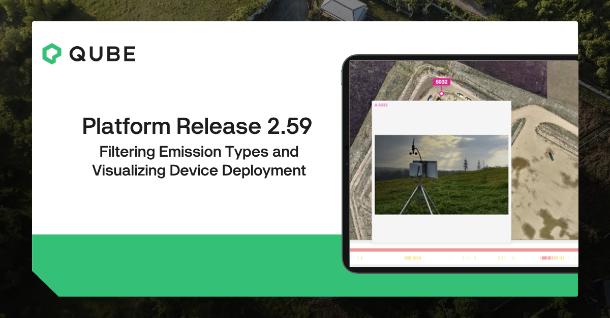
Qube Dashboard Release 2.59: Easier Emissions Filtering and Better Device Deployment Images
Release 2.59 helps users classify and review emission types faster and gives clearer visual context for devices deployed in the field.
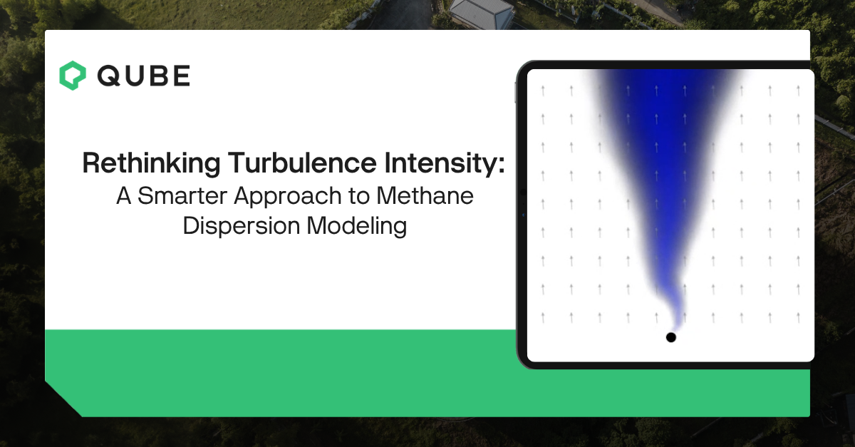
Rethinking Turbulence Intensity: A Smarter Approach to Methane Dispersion Modeling
Emission models are just as important as the devices used to detect methane.
Here, we show how we have improved our emissions model to better account for turbulence, the rapid fluctuations in wind direction and speed that drive dispersion.
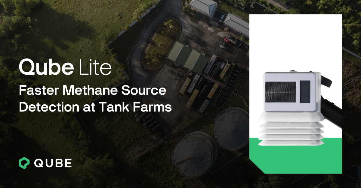
Qube Lite: Faster Methane Source Detection at Tank Farms
When potential methane sources are located close together, how do you know which unit is actually emitting?
This case study shows how Qube Lite, our new intrinsically safe methane sensor, helps operators distinguish emission source from a single tank at a tank farm.
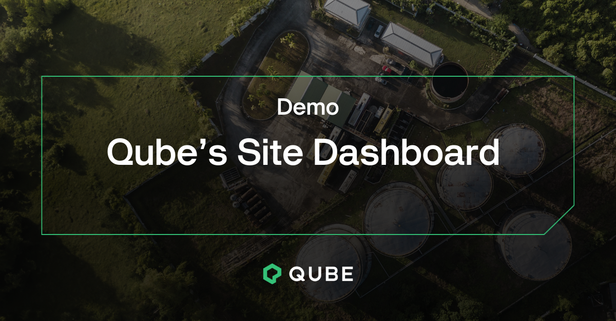
Demonstration: Qube’s Site Dashboard
Qube's site dashboard makes it simple to visualize emissions, spot trends and track repairs.
This walkthrough shows how the platform connects to site equipment and monitoring devices, including Qube Fenceline, Qube Lite and Qube Camera.
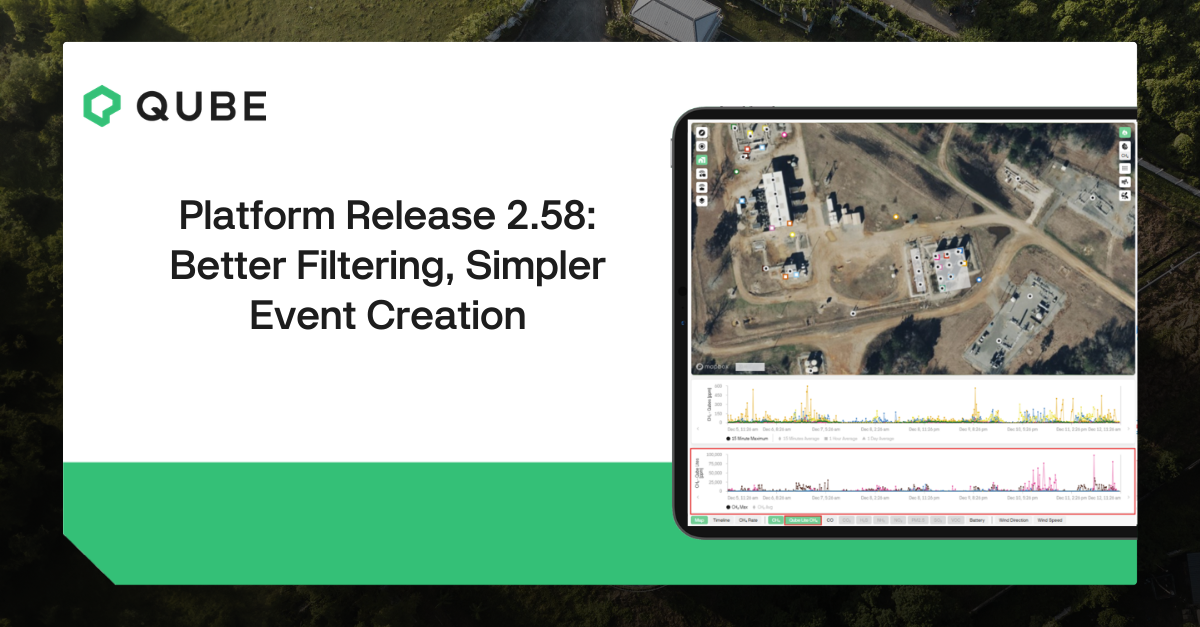
Qube Dashboard Release 2.58: Better Filtering, Simpler Event Creation
Release 2.58 helps you focus on the emissions that matter, streamlines day-to-day workflows, and keeps alarm follow-up clear.
Filter CH4 sources on the rate chart
Filter devices across measurement charts
Streamlined workflow with clearer resolution fields
Bulk classify emission events
Click-and-drag event creation on the timeline
Delayed alarms included in the next-day email
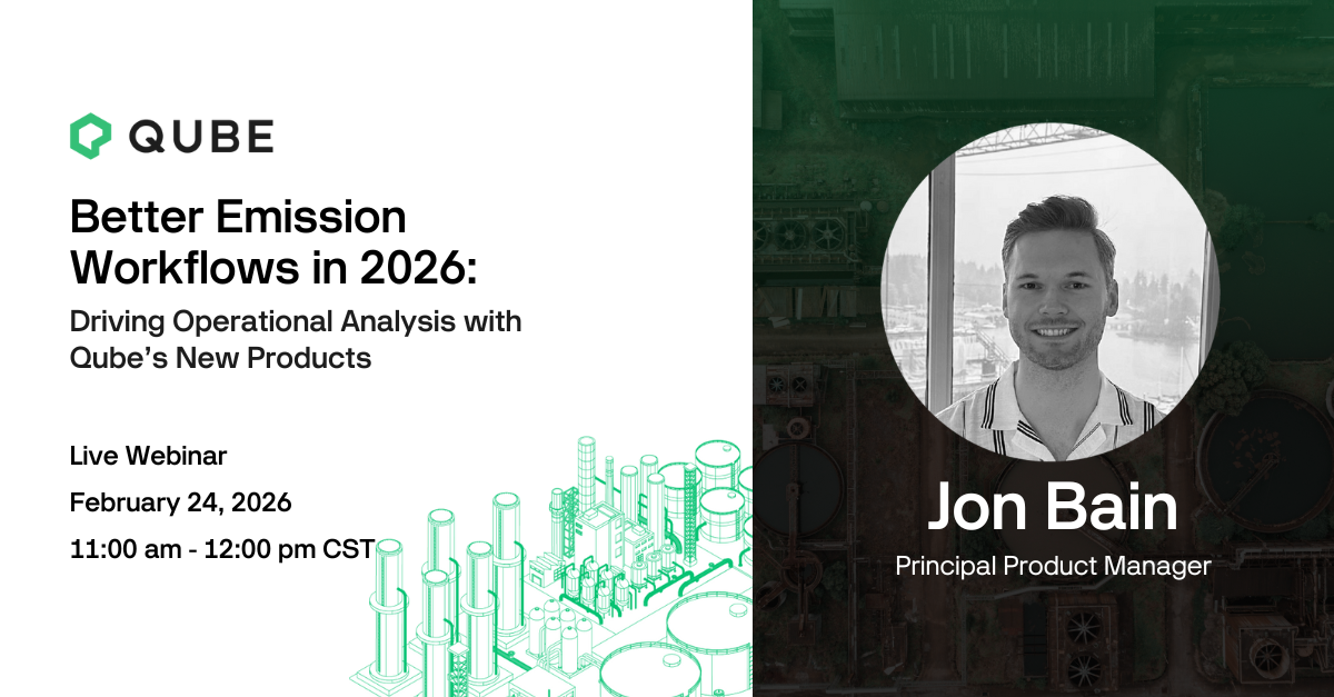
Better Emission Workflows in 2026: Driving Operational Analysis with Qube’s New Products
Qube now delivers equipment-level monitoring (Qube Lite) and imaging (Qube Camera) integrated directly with your process data (e.g., SCADA). By combining emission data with real-time process information, operators gain the context needed to distinguish between routine operations—like venting or blowdowns—and actual equipment failures.
Does Continuous Monitoring Accurately Detect Landfill Methane? FluxLab Tests Qube
Beyond oil and gas, continuous monitoring is an established technology for managing emissions at diverse sites like landfills, mines, and biogas facilities. Qube Technologies recently shared results from a validation program conducted in partnership with FluxLab, focusing on landfill methane detection at scale.
Qube Announces Strategic Funding to Scale Next-Generation Emissions Monitoring Technology
CALGARY, AB – Qube Technologies (“Qube”), the global leader in continuous emissions monitoring, is pleased to announce the successful closing of a new funding round led by existing investors TC Energy with participation from NGIF Capital and other strategic investors. This capital infusion follows a landmark 2025 for the company and is earmarked to accelerate the deployment of Qube’s expanded product portfolio across several industries.
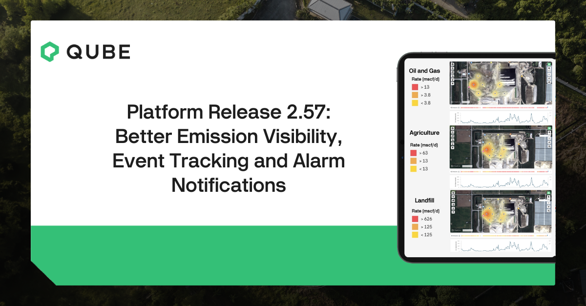
Qube Dashboard Release 2.57: Improvements to Emission Timelines, Event Log and Alarm Notifications
Release 2.57 delivers updates to the Emissions Timelines, Event Log page, and Alarm email notifications.
Emission Detection from Heights: Improvements to Qube’s Plume Modeling
Here we show how improvements to our source modeling resulted in better detection of emissions at heights - like storage tanks. These results are verified by blind, third-party testing at METEC in 2025 where Qube’s continuous monitoring detected all releases from heights during the testing period.
Qube’s Probabilistic Duration Model for Methane Emissions
What’s New?
Improved emission event bounding that accounts for source coverage
Source coverage is calculated based on whether devices are downwind of a particular source at a given time
We use short term probability to determine if correlation between source coverage and methane readings is coincidence or correlated
Given high enough probability, we can fill in short gaps and extend emissions
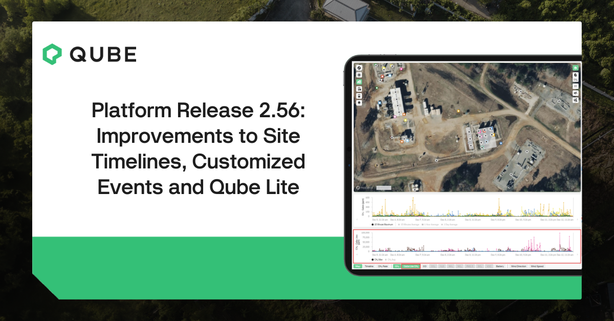
Qube Dashboard Release 2.56: Improvements to Site Timelines, Customized Events and Qube Lite
Release 2.56 brings user-created events and other improvements to the site timeline as well as better emissions visibility by Qube Lite.

Verifying Methane Reductions with Continuous Monitoring: Upgraded Pneumatic Controllers Drive 80% Reduction
Colorado’s Reg 7 requires operators to eliminate methane-emitting pneumatic controllers and prove that new systems cut emissions. This operator replaced gas-driven devices with compressed air pneumatics, then used Qube’s continuous monitoring to establish a pre-upgrade baseline and quantify performance after startup. The fenceline sensors showed an immediate, sustained methane reduction of more than 80 percent, even at sites that were already operating below baseline. For engineering and technical leaders, this project shows how continuous monitoring can validate CAPEX decisions, de-risk compliance, and create a defensible data record for regulators and internal stakeholders.

METEC ADED 2025 Results
Independent testing at Colorado State University’s METEC Advancing Development of Emissions Detection (ADED) program shows that Qube’s continuous monitoring system reliably detects the leaks that drive most methane emissions at oil and gas sites. Compared with our 2024 campaign, Qube delivered stronger performance under more demanding test conditions.
In this article we walk through the results in four areas: localization, emission rate prediction, detection capability, and quantification. We also link to the final METEC report so you can review the full third-party results.

Qube Dashboard Release 2.55: Default Filters and Alarm Notifications
Release 2.55 is here. If you manage emission monitoring for a subset of assets, this update is for you. Set your Default Filter to focus the Overview and Emission Analytics on only your sites or regions and optionally limit alarm notifications to the same filter to cut noise.

Understanding Probability of Detection and Time-to-Detection: The Continuous Monitoring Advantage
For continuous monitoring, Probability of Detection (PoD) can be framed as a function of time. Detection confidence grows with each measurement window. Here we explain how controlled-release testing and time segmentation translate PoD into Time-to-Detection (TtD) and contrast that with single-pass survey methods. For operators, this provides a practical way to set expectations for how quickly a continuous system will find different-sized events and why that matters for response.

Time-Bounding Large Release Events with Continuous Monitoring
Most LDAR methods capture only a snapshot, so they miss when an event starts, when it ends, and how long it lasts. Without that timeline, it can be challenging to quantify released volume, verify repairs, or determine whether the source is constant, intermittent, or tied to specific operations. Qube’s continuous monitoring provides 24/7 data that time-bounds emission events, enabling accurate volume estimates and confident repair verification.

Qube Dashboard Release 2.54: Enhancements to Qube Lite Functionality and Visualization
Release 2.54 is live. Operators running mixed deployments of Qube Axon and Qube Lite can now identify device type at a glance, distinguish severity faster, and tailor Qube Lite alarms to each monitored equipment. It’s improved operational awareness and faster responses.